

The Baby Squad
Organizational structure
In my first year at Johnson & Johnson’s internal design team, I served the “Baby Squad” within the consumer division (now Kenvue), which consists of the broad categories: Essential Health (17 brands), Self Care (50 brands) and Skin Health (18 brands). In addition to UX design, my team provided all digital design services ranging from banner assets, iconography, emails, to recommending layout options tested for user feedback.
My squad comprised 5 brands: Johnson Baby, Desitin, Aveeno Baby, Aveeno Kids and Vivvi & Bloom.

Johnson Baby: the problem
The site lacked typography which, “is critical in establishing hierarchy and expressing brand presence that supports an effective digital experience.” (material design)
Inefficient purchase funnel in PDP
Incorrect color usage


Johnson Baby Web Style Guide using the “Vital” Design System
In the first iteration of the styleguide the Design System was used by the designers across consumer brands and communicated to developers one-on-one via prototypes
We went from using Adobe XD deliverables to Figma, tokenized deliverables
The typography changed from “major third” to “minor third” on the type scale
The text styles for Figma would accomodate more variations and measured in EMs (translated as pixels for the designers)
As the design system was being updated to be used across all brands with tokenization for development, variables for each brand were created.
Johnson Baby PDP redesign iteration 1
Using the design template, I inputted the design system typography and colors in phase 1.
The CTA flow is completed using a modal screen which allows the CTA button and product details to be in the first screen fold.
Johnson Baby PDP redesign (for launch)
• The redesigned PDP is a combination of applying Vital Design’s (i.e., J&J/Kenvue design system) PDP template and Johnson Baby’s variables.
• The variables were achieved with a global brand audit and collaboration with the internal brand team and the North America brand marketing team. As the U.S. website is pilot for this redesign using Vital Design and Figma tokens, these decisions will be followed and customized locally.
See below:
Figure 1 is an example of another brand using Vital Design’s PDP template. The 2nd fold is different from Johnson Baby’s
Figure 2 is the brand template, with annotations to highlight changes
Figures 3 & 4 showcase use of sub-brand (product collection) colors in the PDP to enhance their look and feel
Figure 1

Figure 2
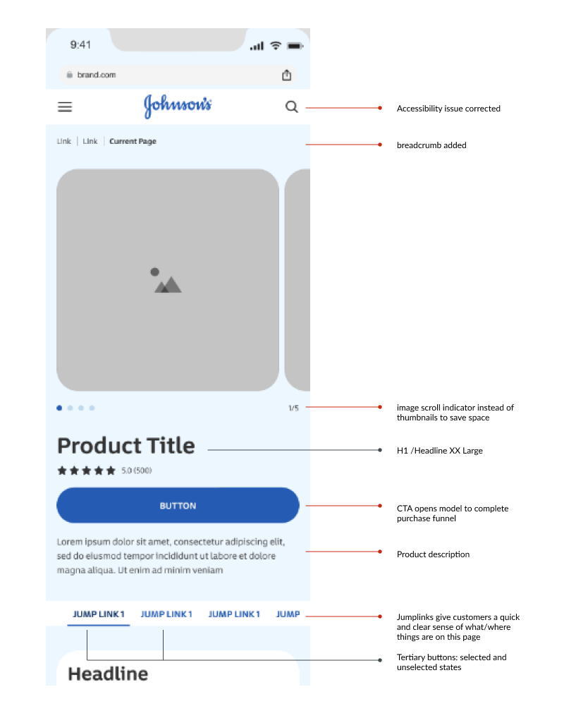
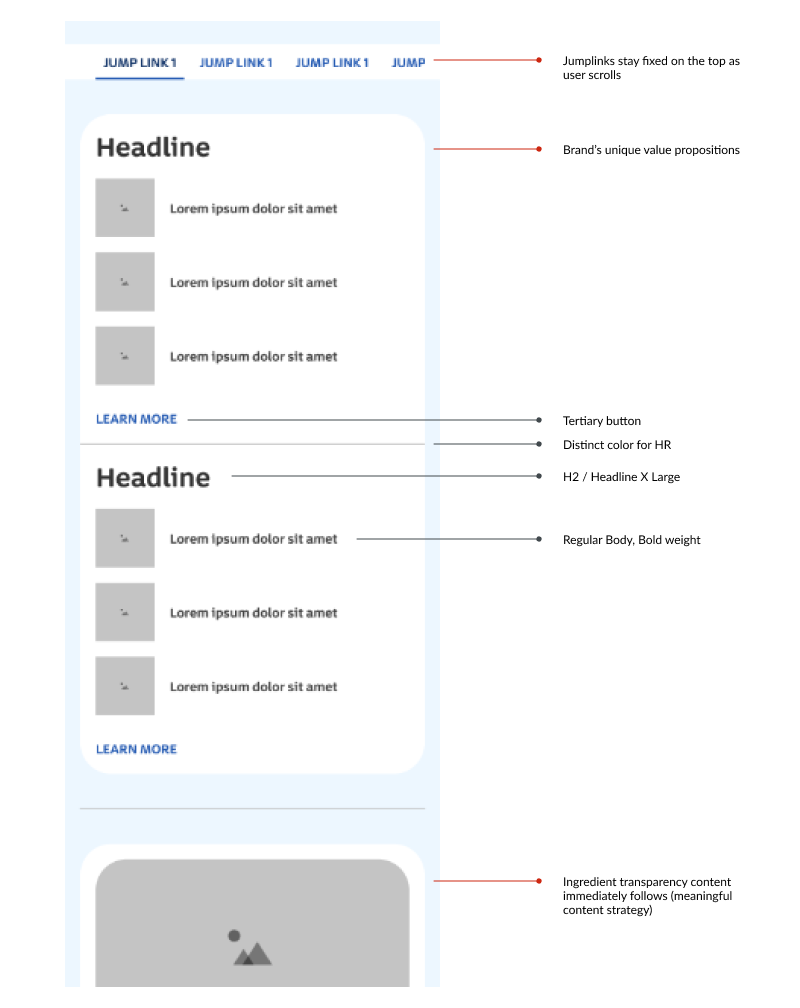
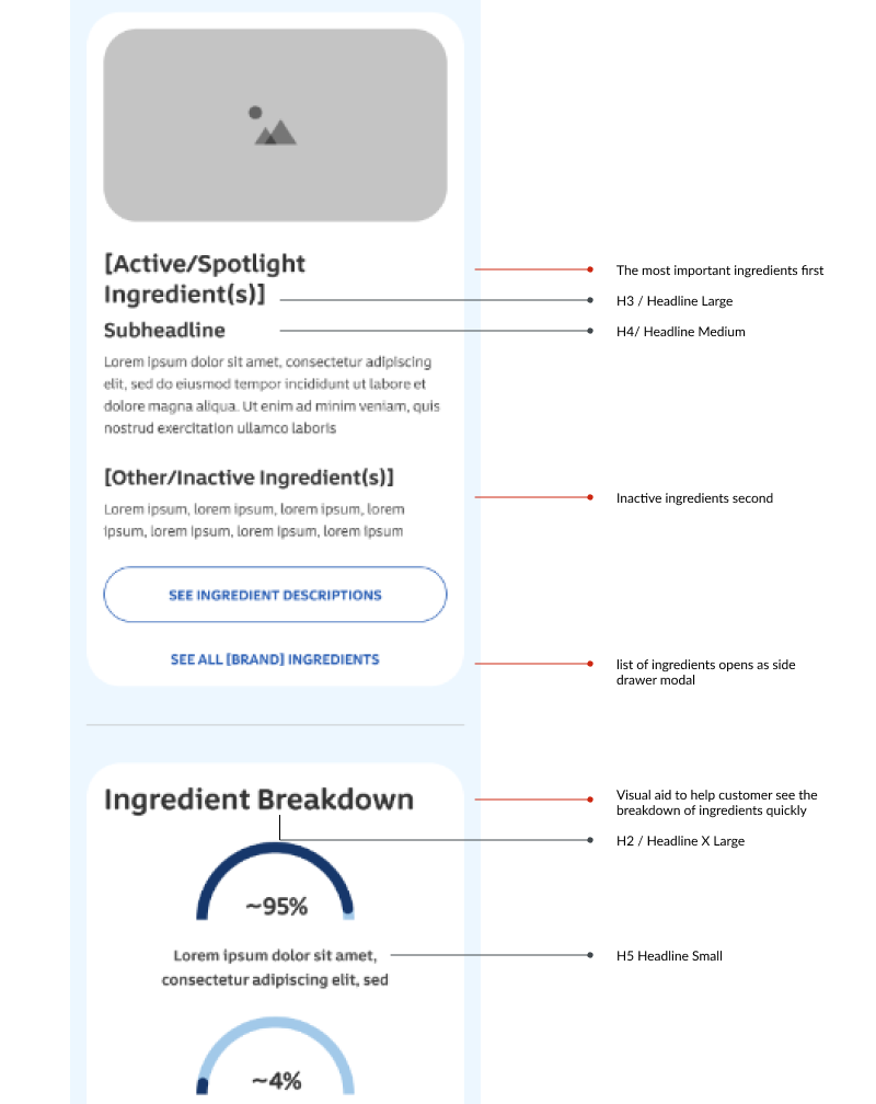
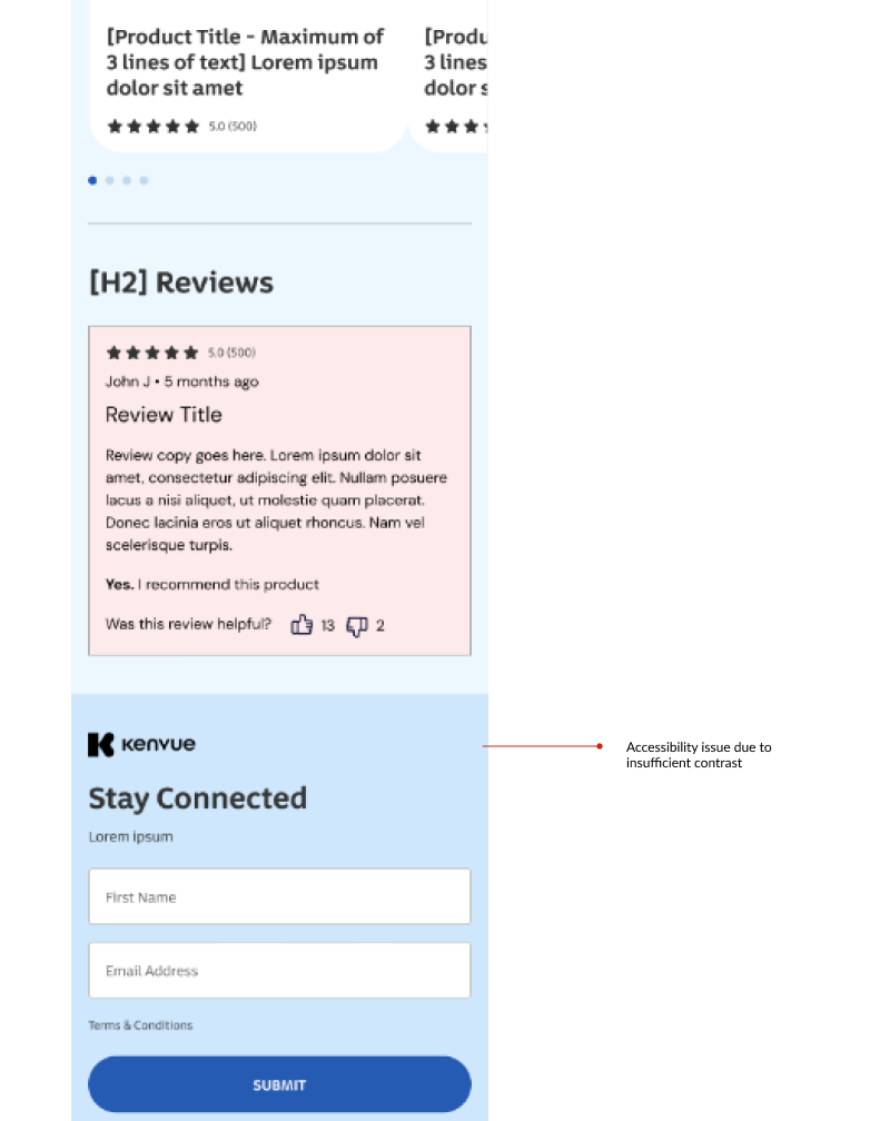
Figure 3

Figure 4

Achieving the color palette with global audit & collaboration across teams
To create the Johnson Baby color palette Alex Gross, lead designer and myself had a conversation with the brand team that worked with Donor Agency to revise the Johnson Baby Brand Guide as well as the marketing team.
The marketing team explains goals and strategies in mind for the consumer with its use of collection-inspired color.
The global audit reflected this and our challenge was to provide consistency while having multiple color schemes, and simplicity to not distract the eye in the shopping experience but also from the overall brand identity itself: “baby”, “soft” and the trusted science of “no-tears”.


Aveeno Kids


